
Wah Kwong — Shipping
Corporate rebrand for an industry giant
Background
Founded in 1952, Wah Kwong is a Hong Kong-based international shipping company. A true pioneer of the industry, Wah Kwong remains one of the few privately owned shipping companies in the world with one of the most modern and efficient fleets of globe-crossing ships.
Wah Kwong tasked us with refreshing their visual identity.

Strategy
Although strong and identifiable, the Wah Kwong branding needed modernisation. We set out to create a vessel to carry it’s corporate values into the future.
With a seventy year history of family ownership, Wah Kwong has built a huge amount of respect and equity in the market.
Working with the management team through the brand strategy, we developed the idea of ‘stewardship’ as a brand pillar and the corporate mission statement: ‘Wah Kwong exists to steward the responsible future of the shipping industry.’

— Existing brand lockup
Expression
The updated identity builds on the equity of the existing logo while also modernising the brand. We kept the brand colours, updating the flag icon and logotype with a minimalist expression.
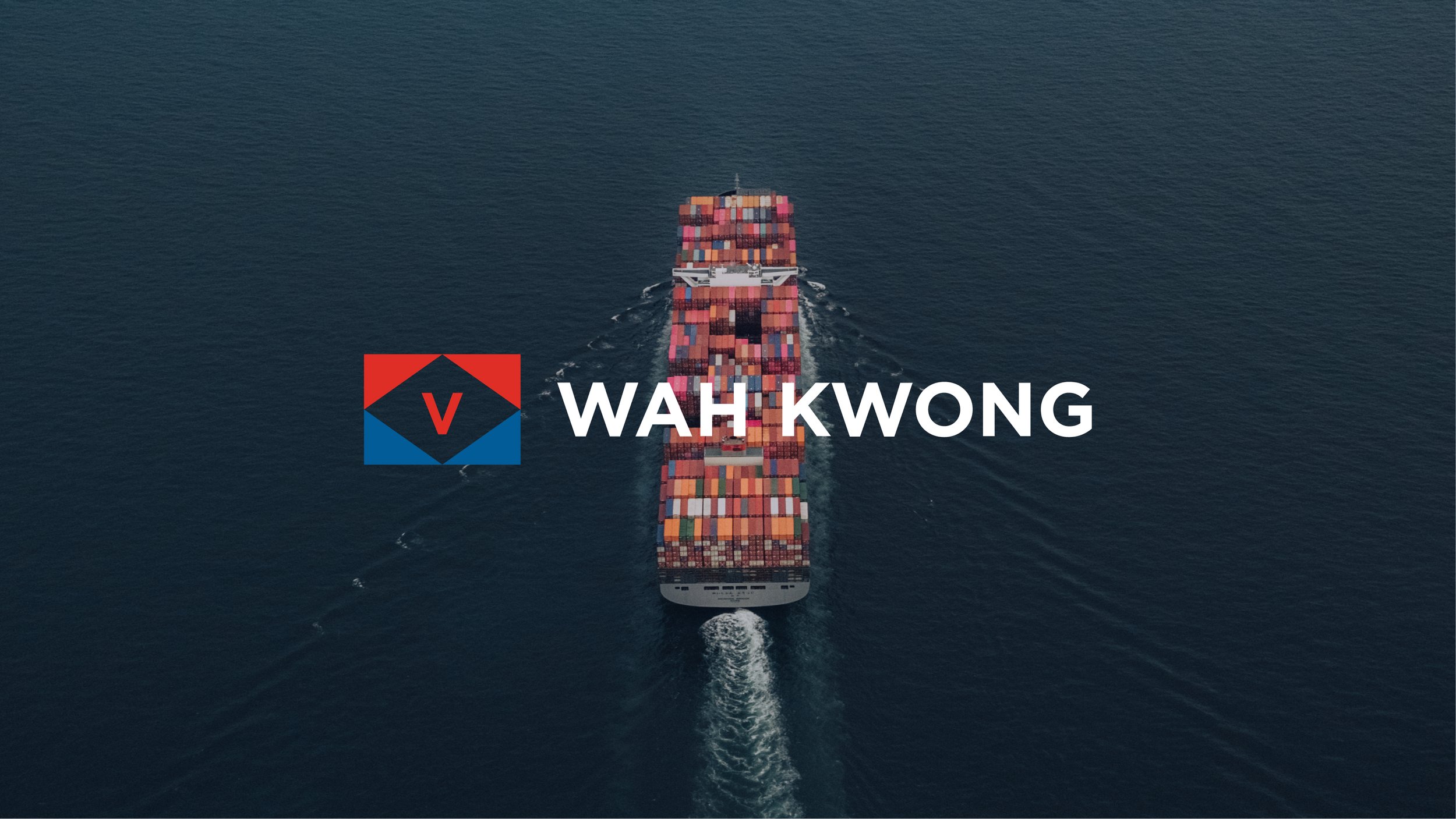
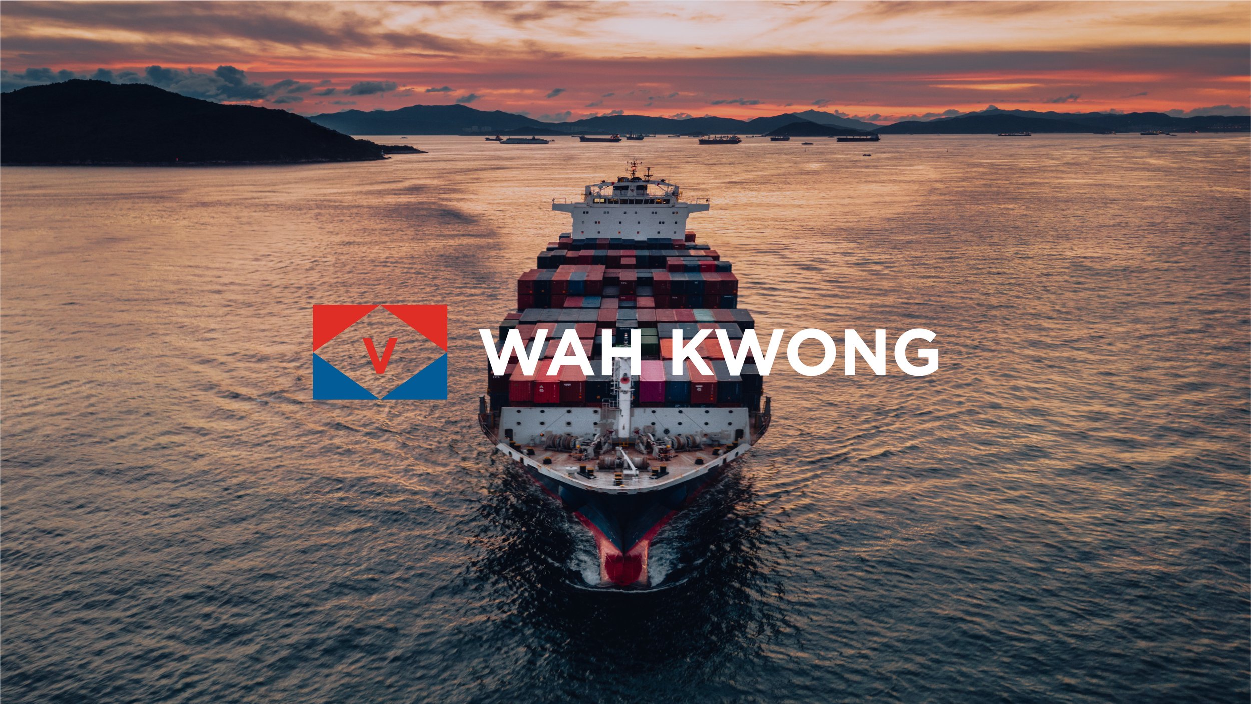
The flag icon is flattened, improving functionality and consistency across all kinds of brand touchpoints. The flag’s white middle is removed, allowing the logo to act as a frame when used on imagery. The logotype uses a modern, sans-serif typeface.

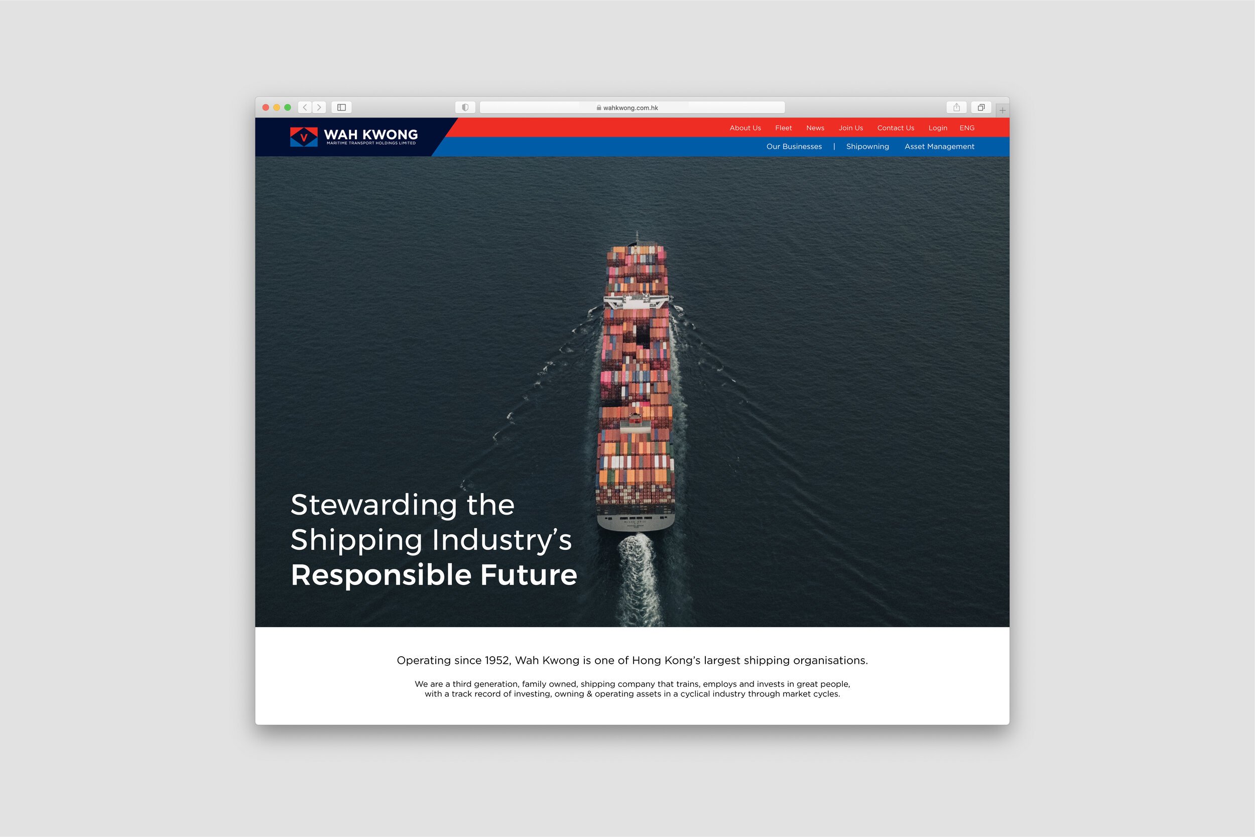
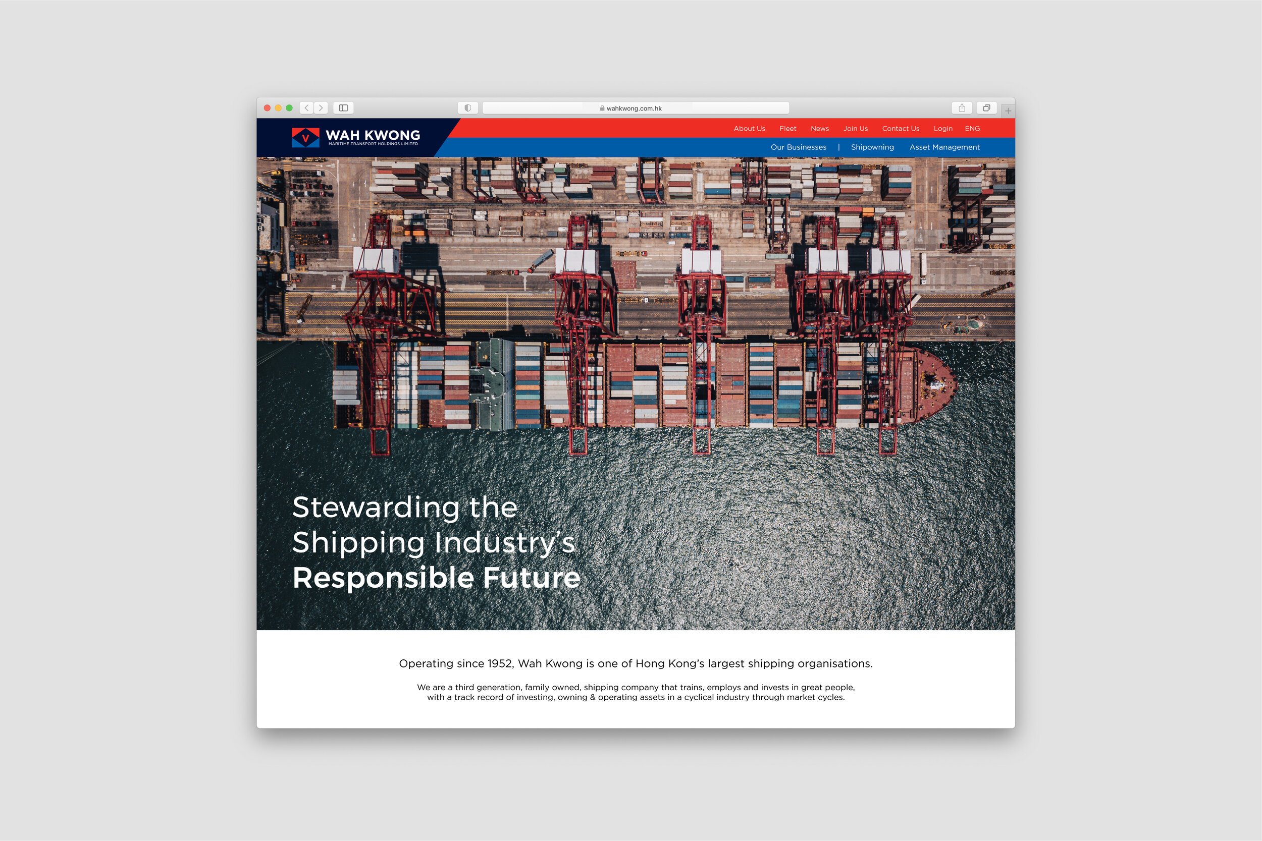
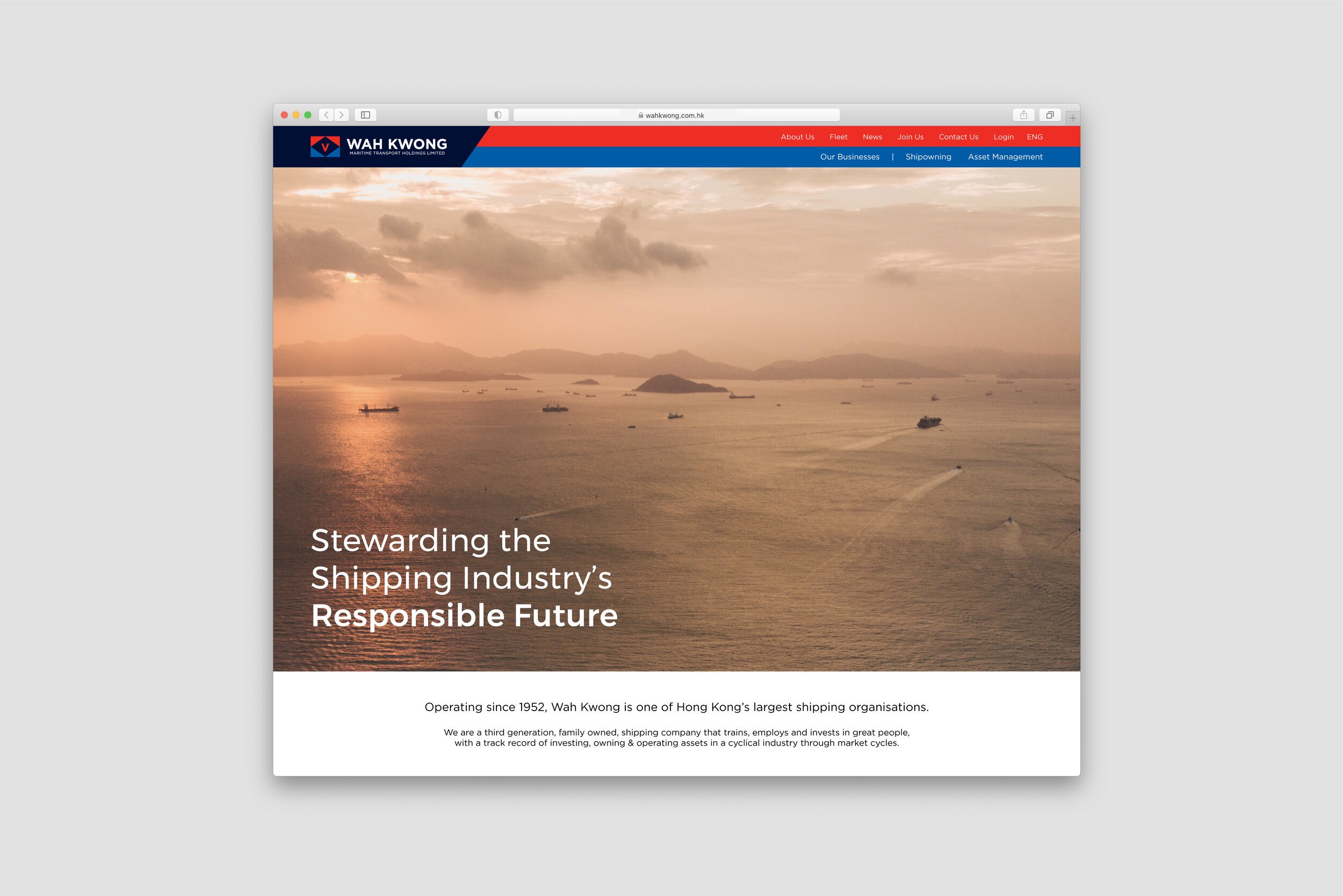
The overall look and feel is clean and contemporary, in-line with the corporate direction of transparency and environmental responsibility. Wah Kwong are taking a leading role in the industry’s future, setting environmental standards.


— Brand guidelines overview