Butler — TECHNOLOGY
Branding a home service disruptor
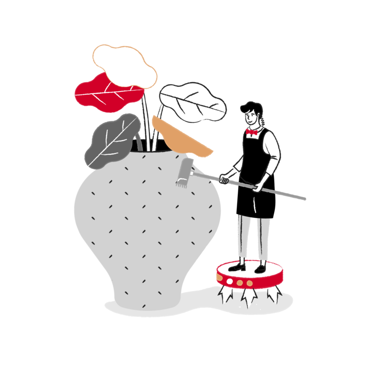
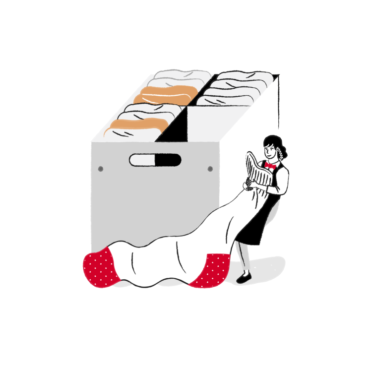
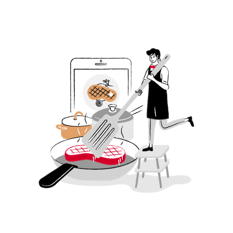
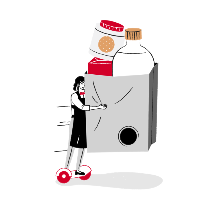
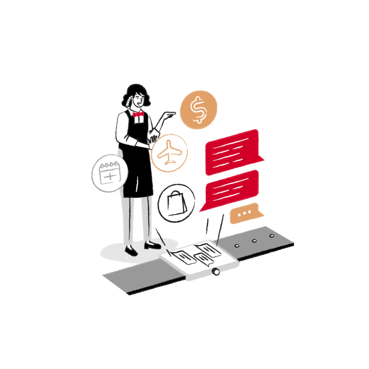
Butler is a home-management service provider determined to turn the housekeeping industry on it’s head. Through an on-demand mobile app, Butler can bring a range of high-end home-keeping services into any home. After 5 years with the original identity, Butler approached us to smarten-up their visual identity, to graduate them to the next level.
The existing brand identity suffered a few difficulties. The traditional typography did not lend itself to feeling like a tech-oriented company. The proportion between logotype and logo and the stacked lockup, caused difficulty. Also the logomark was not unique or ownable.

Existing Butler branding
Through discovery sessions with Butler’s stakeholders, we decided to keep a couple of the strongest brand assets that customers had known to associate with the Butler service. The bowtie and the red.
We refreshed the logo and logotype lockups, developing the marks into something that could be unique and ownable.
The two ‘b’ characters express the notion of partnership between the butler and employer, while also representing the bowtie, holding the equity of the original branding.