
What Japan’s prefecture flags teach us about great logo design
Japan’s prefecture flags can teach us a great deal about branding and visual identity design.
By Adam Charlton · 12 November 2022
Posted in Insight
Japan's bureaucratic administration has three levels: national, prefectural and municipal. There are 47 prefectures, each with its flag.
Japan's prefecture flags can teach us a great deal about branding and visual identity design, the importance of simplicity and clarity, the requirement for a shared graphical language and consistency, and the critical use of colour, symmetry, circles, and nature. In this post, I dissect these topics.
Importance of simplicity and clarity
Clear messaging delivered in simple shapes helps to differentiate the individual prefecture identities. The most memorable corporate identities use clear and straightforward iconography, creating memorable links between the identity and its values.
What makes these flags truly remarkable is their ability to embed deep meaning within extreme visual simplicity. Each design is a carefully considered narrative, where every line, colour, and shape carries cultural, geographic, or historical significance. This approach teaches designers that a great logo is never just a pretty picture—it's a compressed story waiting to be decoded.

Aichi, a stylised hiragana of あいち (Aichi). The emblem also expresses sunrise and an ocean wave to indicate Aichi's location facing the Pacific Ocean.

Fukuoka, a stylised hiragana of ふく (fuku). It also represents ume (plum), the prefectural flower.
Requirement for a shared graphical language and consistency
Aspects of each of the designs are shared across the series of marks, which allows for the shared visual unity.
The scale and placement of the mark inside the boundary, the logos are centred, and of similar height and width, which creates similar-sized borders within each flag; thus, each flag has the same visual weight or power.
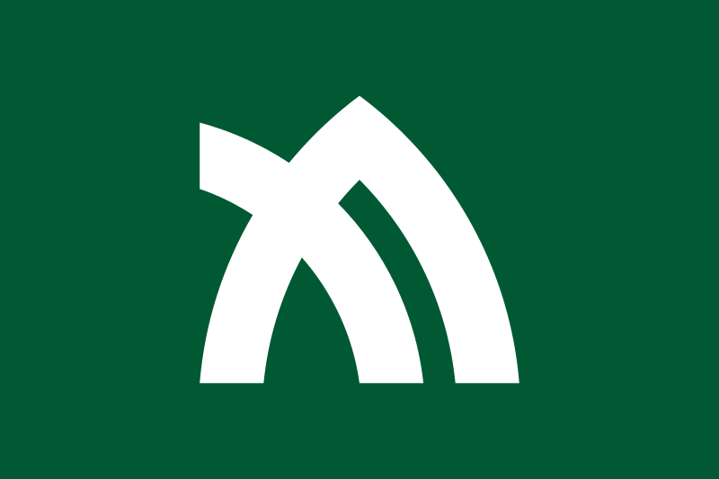
The designs are consistently complex, with just one concept illustrated in each. They often depict the prefectural flower or a bird' s-eye view of the prefecture's capital city.
Corporate identities must have brand usage systems and guidelines to ensure their brand is consistent across multiple touch-points, media and geographies.

Hiroshima, a stylized katakana of ヒ (hi).
Kagawa, a stylised and slightly rotated katakana of カ (ka). It also represents mountains, as well as leaves of the olive, the prefectural tree.
Critical use of colour
With simplistic colour palettes, the mark is often white against a darker, muted background, with each flag using no more than three colours. The colour palette is muted, considered, and restricted. Each flag looks complete alone or grouped against several other logos.
Within corporate identity design, the critical use of colour translates maturity and trust to the viewer.
Japanese prefecture flags are masterful in their use of colour and contrast. They understand that colour is not merely decorative but a powerful communication tool. Each flag uses colour intentionally – to create visual impact, evoke emotion, and distinguish itself from others.
The stark contrast in these flags – often using just two or three colours – creates immediate visual recognition. This principle is crucial in logo design, where a brand must be instantly identifiable, even at a glance or in small formats.

Saga, the mon is Japanese cinnamon, the prefectural flower.

Ōsaka, the blue stands for cleanness, freshness and intelligence and also represents the sky and sea due to Ōsaka City having both an airport and seaport. The blue also represents Ōsaka's nickname water city, due to having many rivers and facing two seas. The mon represents calabash, the symbol of Toyotomi Hideyoshi. Circles also mean the letter O.
Symmetry and geometry illustrate visual completeness
Symmetry in many prefecture flags helps translate feelings of completeness and unity.
Corporate identities that utilise these ideas include Pepsi, AT&T, Vodafone, General Electric, NASA, LG and Yamaha.
Geometry plays a crucial role in these flags. Shapes are not randomly chosen but carefully constructed to create balance, symmetry, and visual harmony. Circles, triangles, and stylised representations are placed with mathematical precision, teaching designers the importance of intentional composition.
This geometric approach reveals that great design is not artistic whimsy but calculated visual communication. Every element has a purpose; every line has meaning.

Okinawa, a white letter O within a red disc on a white field.

Ibaraki, the prefectural flower rose on blue field. Blue stands for the Pacific Ocean and Mount Tsukuba.
Symbols of nature translate feelings of honesty, hope and positivity
Images of nature, such as the prefecture flowers, are often used as the symbol on the flag. Relevant corporate identity examples include Apple and BP.
Japanese prefecture flags are more than regional symbols – miniature manifestos of design philosophy. They remind us that great design is not about adding more but revealing more with less.
Like a great flag, a great logo does not just represent – it communicates.

Kyoto, a stylized kanji of 京 (kyō).

Hokkaidō, a seven-pointed star standing for hope and development. Blue represents sea and sky of Hokkaidō, red stands for people's energy and white for light and snow.
Prefecture Flags

Back to the Blog

About the author —
Adam moved to Hong Kong in 2012 and founded the branding agency BrandCraft. Adam has built brands for companies at every growth stage and has consulted for some of the world’s most recognised companies.